
DS EMOVA GmbH
Cyclos Design GmbH
Art Director
Rebranding

The Diersch & Schröder Group was entering a defining transformation: bringing several established energy brands together under one shared identity.The vision was to create a modern, future-focused energy company that intelligently connects conventional and renewable energy.
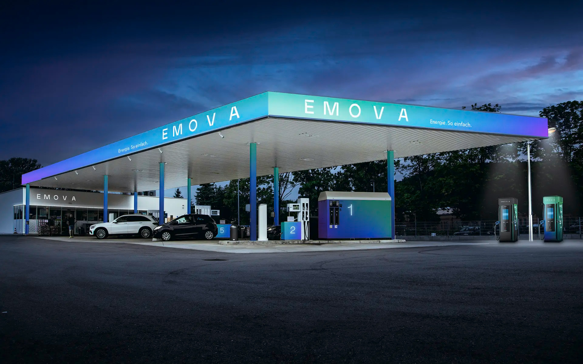

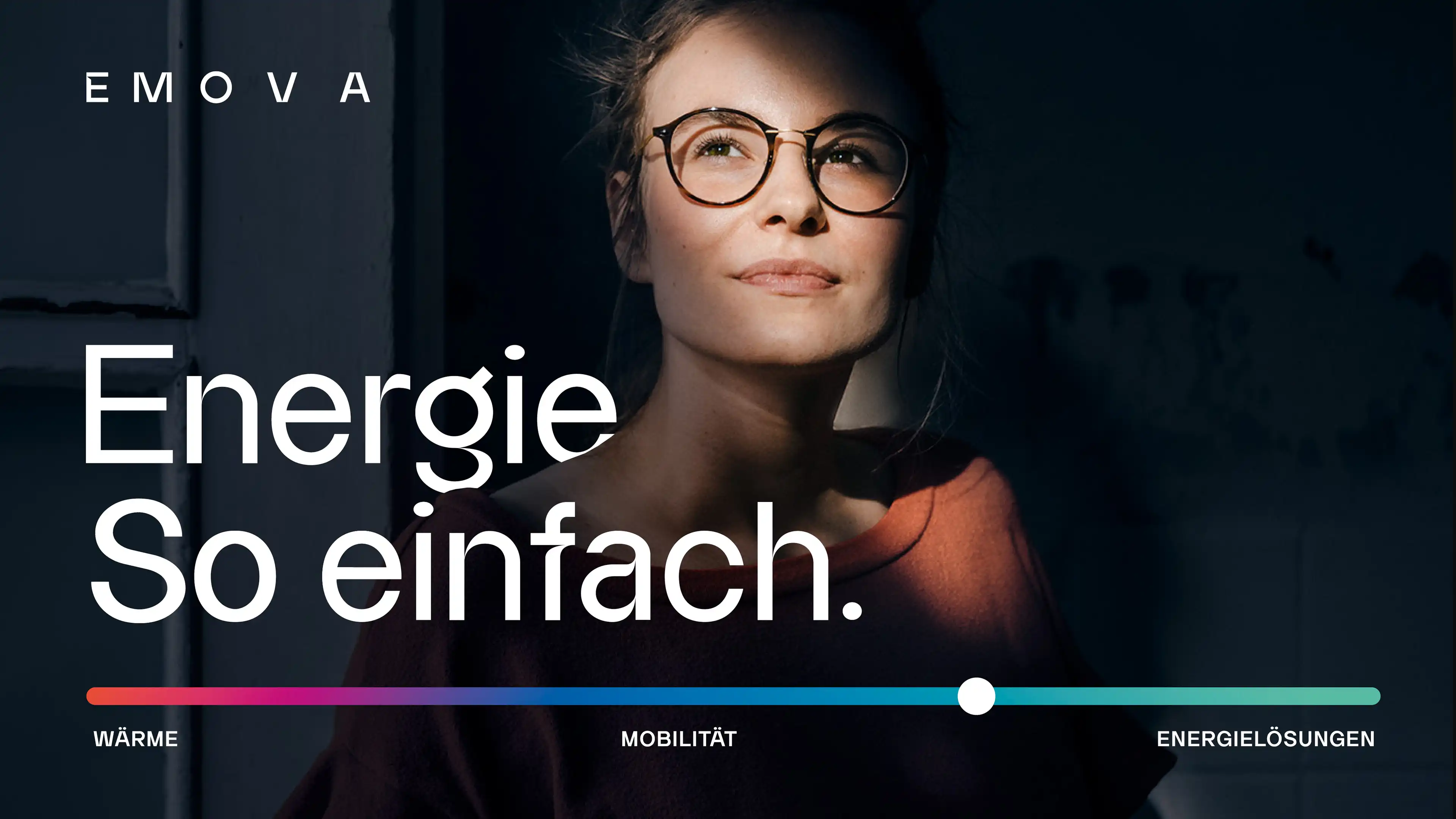
The goal was to position EMOVA as a new kind of energy provider. One that makes energy supply transparent, sustainable and, above all, simple.
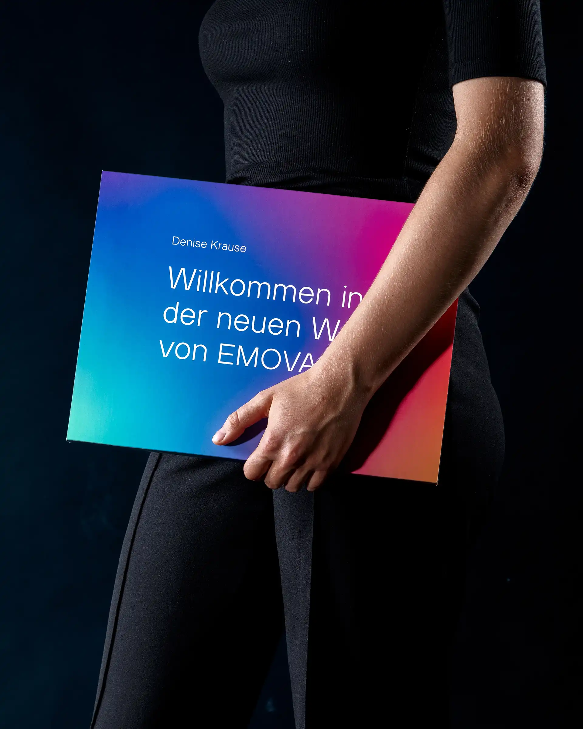
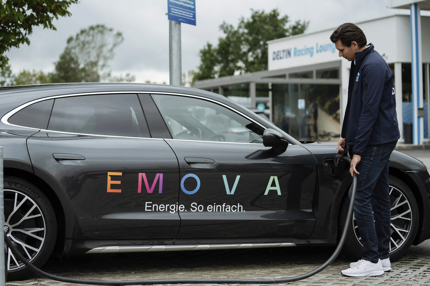
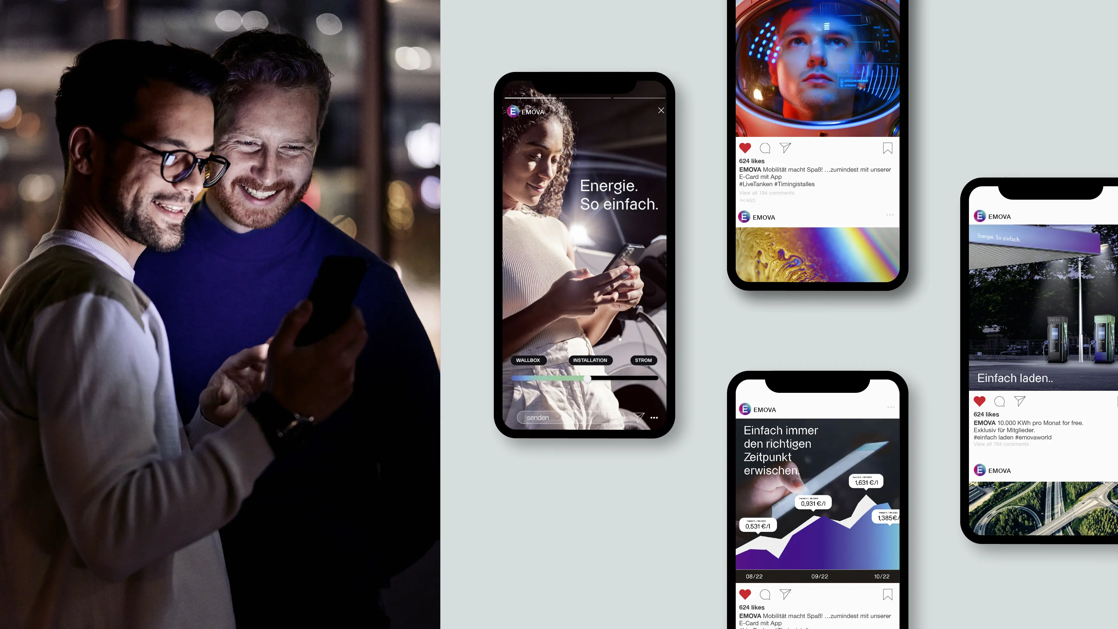
As Art Director and Brand Designer, I helped turn EMOVA’s vision into a clear, cohesive identity — shaping the brand concept and key applications across digital and physical touchpoints.

Through strategic brand workshops, the name EMOVA emerged from the ideas of movement and well-being.
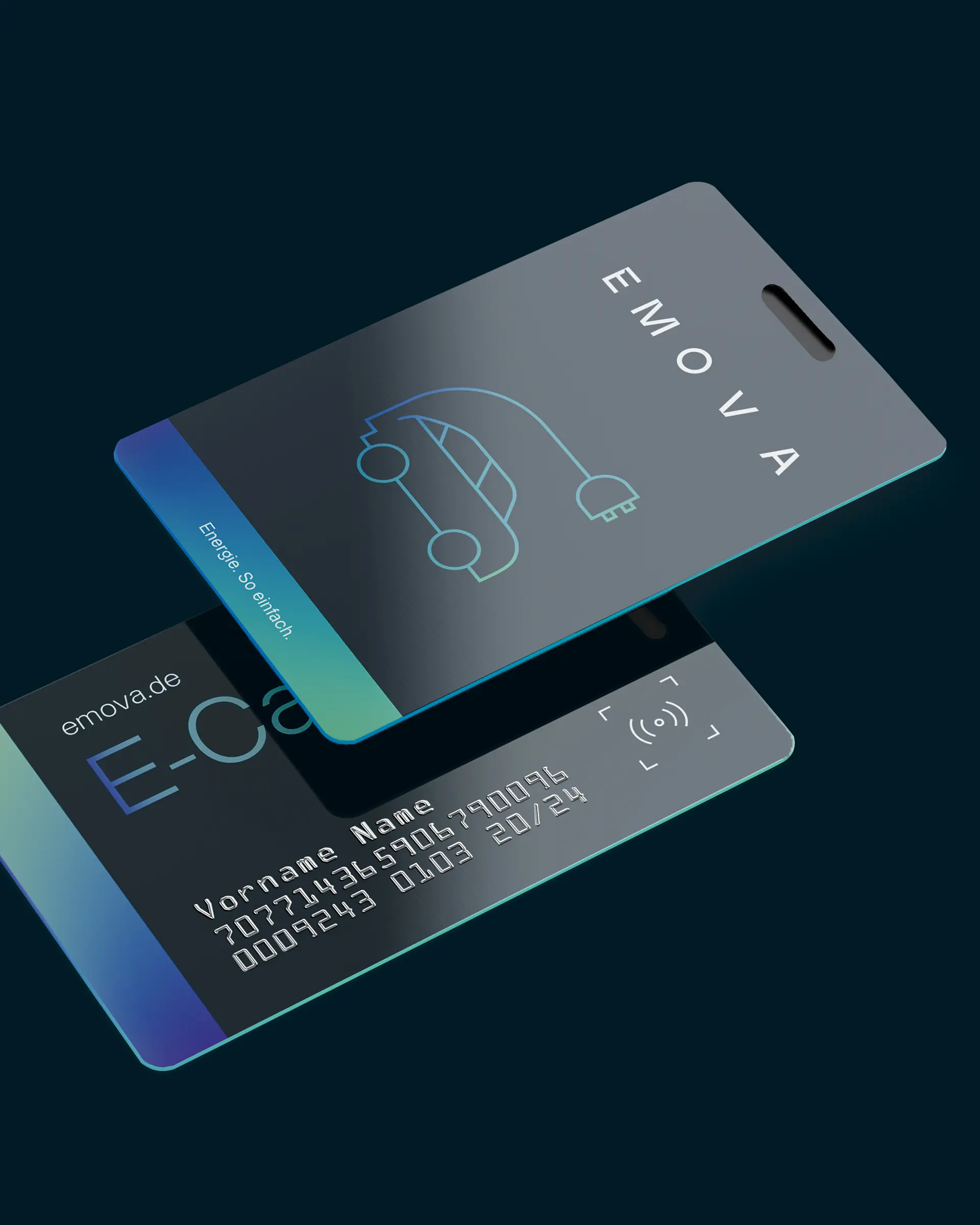
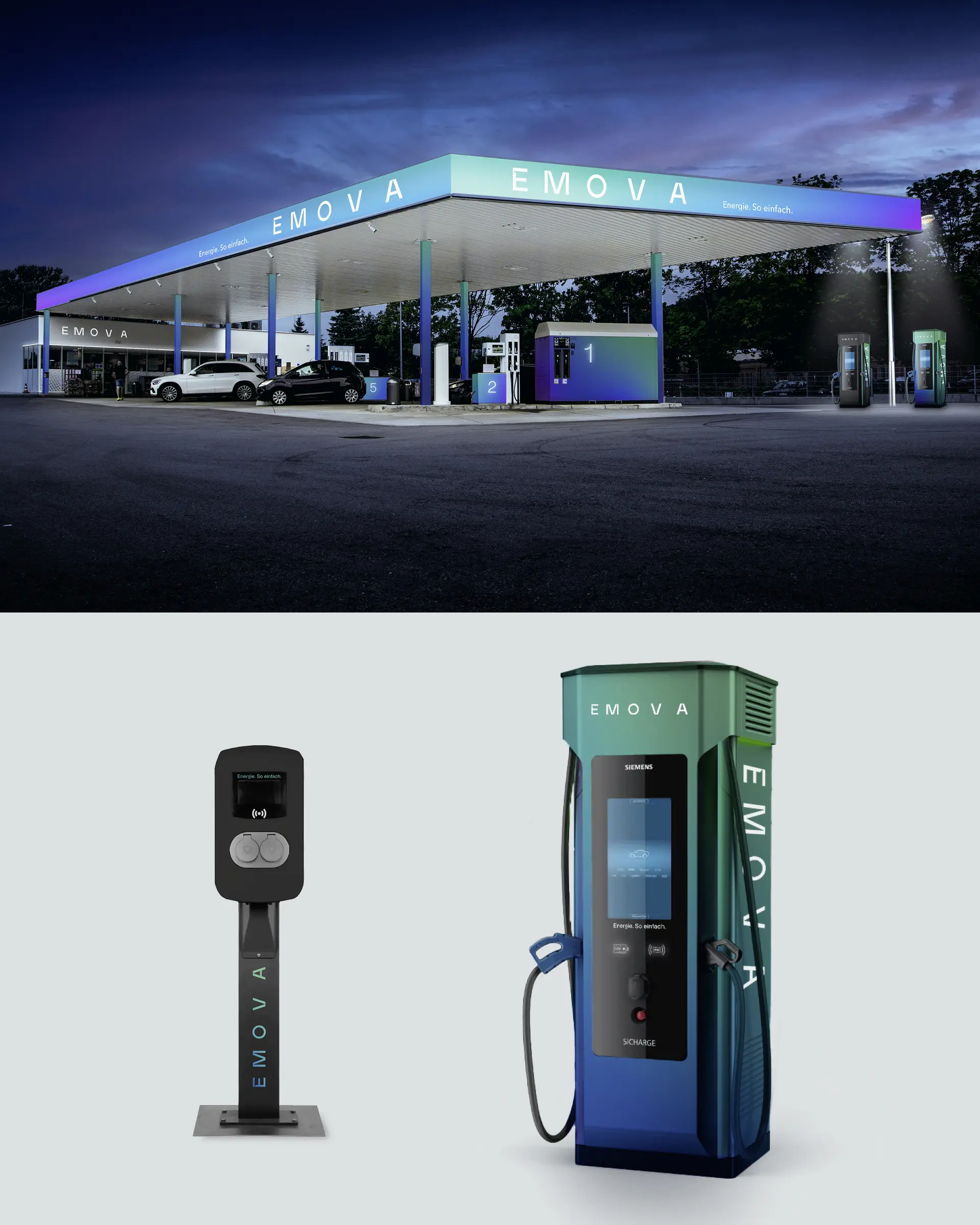
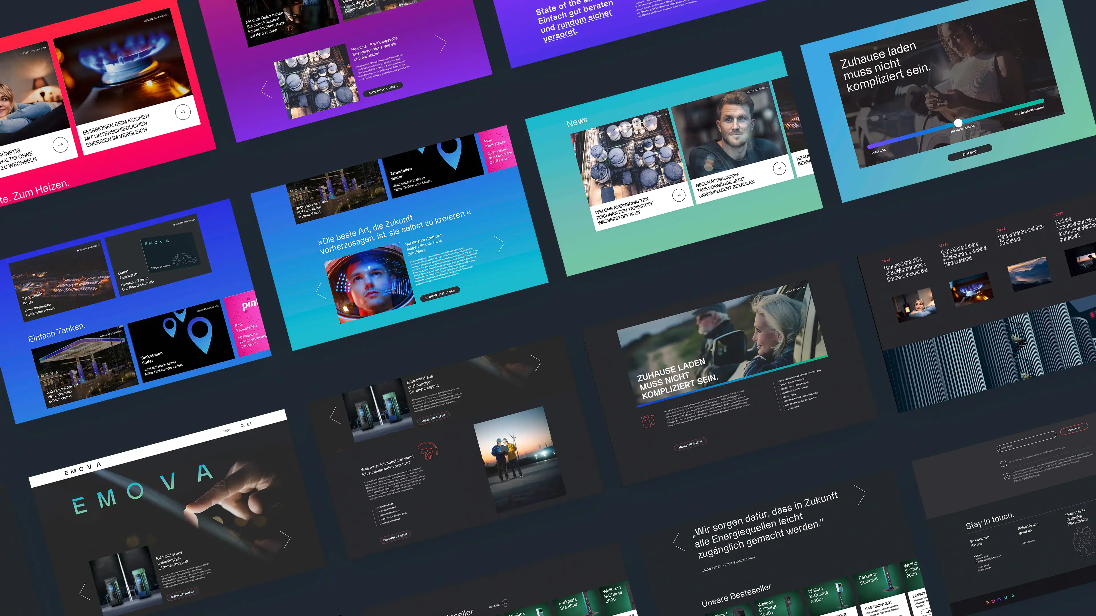
EMOVA was created to make energy feel simple, accessible and human. The new identity translates this idea into a focused visual language. At its heart is the Energy Field: a dynamic design element whose flowing color gradients represent the brand’s flexible energy solutions. The wordmark uses varying letter spacing to express movement and progress.